Thursday, August 27, 2009

More Tulsa Wedding Show


The Calligraphos, Ink booth at The Tulsa Wedding Show was located right next to The Oklahoma Photo Booth. I could not resist bopping inside with Lauryl to ham it up a bit just as the last guests were leaving the show and the venders began breaking things down. We were pretty goofy by that time as can be attested to by the pics! Note us comparing our looong tongues (I cannot imagine where she got hers!).

Lauryl has recently posted her photos of and remarks about the Calligraphos, Ink booth at the show. Since the only shots of it that I've posted thus far were taken on my iphone, I thought you readers would enjoy seeing Lauryl's blog.

Friday, August 21, 2009

The Calligraphy Lesson : Part Three, Monoline & Drawn Letters


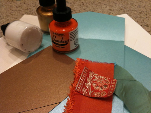
 Calligraphy by Victoria Hoke Lane,  Pigma Micron 05 pen
Invitation by Picture Perfect, design by Tina Blanck;  Photography by Lauryl Lane


This fun template invitation (the gown is actually suspended on the form) begged for the monoline handwriting script used. Monoline refers to the fact that this style has no thicks or thins. It remains the same weight throughout the letters. Technically, monoline letters can be made in any style (for example, monoline Romans, monoline uncials, etc.). But I use monoline to refer to this particular handwriting script which I use for many ephemeral applications.
[The Royal Doulton figures of Jack and Jill were a grade school gift from my paternal grandmother, a marvelous oil painter and significant influence in my early years.]


Self-promotional Postcard: Lettering by Victoria Hoke Lane,  Illustration by Keith Criss


By way of clarifying the difference between pen-made and drawn letters, I present this last example. These letterforms - which have elements of both italic and script - have been drawn. Pen-made letters have various characteristics that result from the tool that is used (be it pointed, broad-edged, flexible or stiff...or even a brush or marker). Drawn letters are precisely that...drawn. I see the letters in my mind and begin to draw them much as one would initiate a portrait from memory. I can also look at antique examples and draw inspiration from them as I rework the original forms.


In either case, the design usually goes through a number of tracings until it is refined to the designer's satisfaction. At that point, the outlines are inked and then filled in. Today this process is often accomplished wholly on the computer. I prefer to work by hand and then translate my design to vectoring. I feel that this preserves more of the intimacy of hand-lettering. This is a time-consuming process, but can result in wonderful titles, logos, etc.


Thank you, dear Readers, for bearing with me to the completion of these lessons. I venture to say you have gleaned a new understanding of several aspects of calligraphy, and I thus commend you!

Monday, August 17, 2009

The Calligraphy Lesson : Part Two, Script


Calligraphy by Victoria Hoke Lane
Invitation by Marcel Schurman Company, Flora Bella Collection by Brenda Walton; Hunt nib

This lettering inscribed on the gifted Brenda Walton's beautiful invitation design is an example of pen-made script. We've already learned that pen-made means those letters have come directly from the pen, and in the case of original art such as the earlier italic example as well as this fill-in-the-blank invitation, these letters are not retouched. What you see is what you get, including mistakes, which I have lovingly come to regard as almost charming (read almost) in my many years of experience.


Script letters are made with a pointed nib. The weight of the thicks vs. thins depends upon the flexibility of the nib and the pressure exerted on it. Believe it or not, as recently as 100 years ago, every educated person could write a decent script hand. If you want to improve your self-esteem, improve your handwriting...but that needs to be the subject of another post. Although script is lovely for a brief note or a beautiful placecard, it doesn't lend itself well to long texts as it is difficult to read. Helvetica didn't become universally used for nothing!


Calligraphy by Victoria Hoke Lane
Invitation by Bella Ink Designs; Brause nib, 1mm

I've included this example because it shows what is possible in terms of variations on a given style. I chose this portrait style card stock because it matched the Bride's color scheme. It also had another coordinating landscape style card with an equally saucy little design that lent itself well to the rehearsal dinner invite I was also designing. In keeping with the modernity of the design, I used a kind of script variation. In addition to writing loosely and paying little or no attention to "staying within the lines," I used a broad-edged pen nib instead of a pointed one. That resulted in abrupt changes in thicks and thins as opposed to the extreme thins and the "swelling quality" present in traditional script thicks.


Although the letterforms are based on script, because the broad-edged pen was used one might even mistake it for a kind of italic. It has a certain element of elegance, but it is light-hearted as well. When choosing styles of lettering, the formality of the actual event, and the design and/or paper stock are important considerations. Certain lettering styles could be very inappropriate in spite of being beautiful in and of themselves.


{TBC}

Thursday, August 13, 2009

The Calligraphy Lesson : Part One, Italic

Dear, patient Reader,


I have already transgressed the so-called "Rules of the Blog" by NOT blogging daily or at least every-other-daily. But I did get the jobs as promised to my clients last week following The Tulsa Wedding Show, and for that, I am very grateful. I eschew failing to meet deadlines, and it requires no small effort on my procrastinating part. So, barely recovered from nearly fifteen hours of addressing envelopes on Saturday alone, I will begin "The Calligraphy Lesson."


It seems only appropriate to educate the public on a relatively little known subject in today's world. But little known doesn't preclude the worthiness of the subject matter. Calligraphy is clearly a dying art. I know that, in part, because of the fuss that people make over my casual scribbles be it at the bank, the post office or wherever. (However, I have yet to see someone fail to cash the check they claim is too pretty to cash!). So in hopes of stirring up some enthusiasm for one of my passions in life and perhaps a wee bit of inspiration for future scribes, I will discuss the three lettering styles which I use most often in addressing envelopes: italic, script, and "monoline."


Calligraphy and artwork by Victoria Hoke Lane
 Watercolor, gouache, rubber stamps, Mitchell and Brause pens on Arches laid text


The above piece is an example of italic pen-made letters (except for the opening "L" which was "drawn"). Pen-made refers to the fact that those letters resulted from the action of the pen on the paper manipulated by the hand. I say hand because good letters are formed by a firmly, not tightly, held pen that is moved from the wrist rather than the fingers. Italic letters are made with a broad-edged pen vs. a pointed pen and depending upon the relationship of the width of the nib (the part of the pen that is dipped into the ink! with the width measured at the very tip) to the height of the writing line, you can create very bold (heavy) letters to extremely thin (fine) letters. Average letter weight is about 4 or 5 pen widths for the x-height. X-height is exactly what it says: in an alphabet, the height of the lower-case (also called miniscule) "x" measured according to the width of the pen nib used. [Goodness, I hope this is not too daunting. I think I need to create a virtual "blackboard" to make accompanying sketches just like in un-virtual class.]


Italic forms are based upon an oblique (vs. a circular "o") and fit neatly into a parallelogram (vs. a square) shape. The overall texture created by the text (small copy) in this example leans toward light. The text letters are loosely traditional (note the springiness of the forms) while the larger letterforms are more staid. Italic letterforms can be varied and altered in a myriad of ways, lend themselves well to short texts, and for some reason, are many people's definition of calligraphy! But in truth, the word, calligraphy, finds its roots in the Greek, and simply means beautiful writing.


{TBC} to be continued...

Monday, August 10, 2009

Bloggy Intro


Hello, dear reader. I introduce myself tonight and enter the cyber world of the self-published at risk of becoming one more narcissistic voice crying in the wilderness. But how fun to have a medium for expressing the passions of life and art.


I have had the pleasure of the company of my eldest daughter, Lauryl, for the past week. She came to share my domicile and help me prepare for the Tulsa Wedding Show 08-09-2009. For this, my first "trade show", we started with a color scheme that was inspired by a gorgeous Indian silk sari in shades of pale aqua-green, orange and metallic gold, contributed by my dear mother.


IMG_0017


From there we began designing a tablescape with taffeta and silk linens, florals in shades of orange (zinnias, tulips and roses) and glitzy vases at various heights. We rounded it out with hand-painted Springerle cookie favor/placecards that mimicked the flowers and an invitation suite in coordinating colors and ribbon trim. Pretty, if I do say so myself, and I do.
IMG_0030


IMG_0035


But most of all, such fun to talk with all the lovely brides from the very youthful to the more mature but nonetheless radiant ones. Third daughter, Olivia, also helped us with set-up along with her fiancee and his sibs. She plied us with delicious repasts whilst we slaved away being ever-so-creative (doing much grunt work in preparation which is rarely ever creative!).


IMG_0031


IMG_0028


Many thanks to Vicki Taylor and her family for their marvelous coordination of this event. Vicki is truly one of the most gracious and encouraging people you'll ever meet which, no doubt, is just one of the reasons that this has been an event met with ever increasing success. These are merely iphone photos so please excuse the quality. Professional shots will be posted in several days.