I recently collaborated with my daughter
Lauryl Lane and
Esther Ramsey on their gorgeous rustic eco-chic faux wedding photo shoot. The images were featured by the lovely Janie at
The Bride's Cafe in two parts:
Part One &
Part Two. I'll post all of the images here shortly!
Here's what I said about the creation of these paper products:
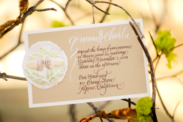
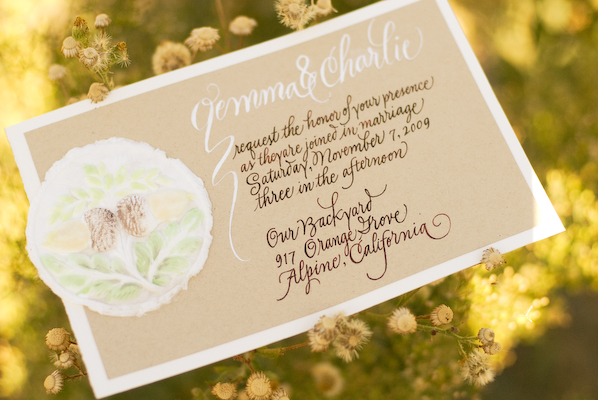
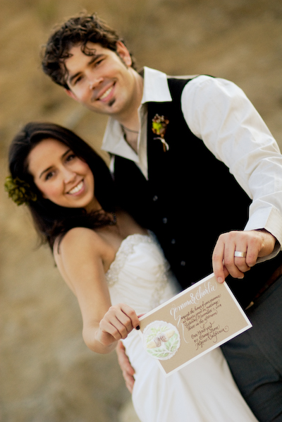
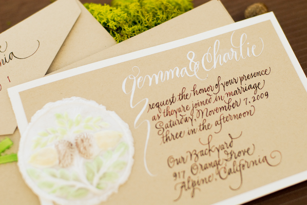
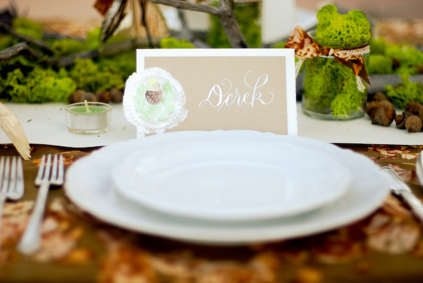
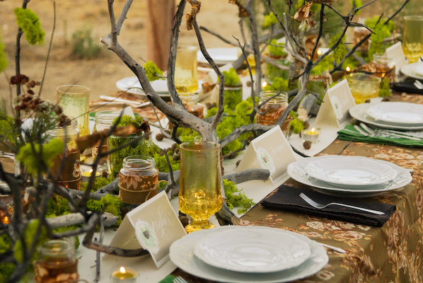
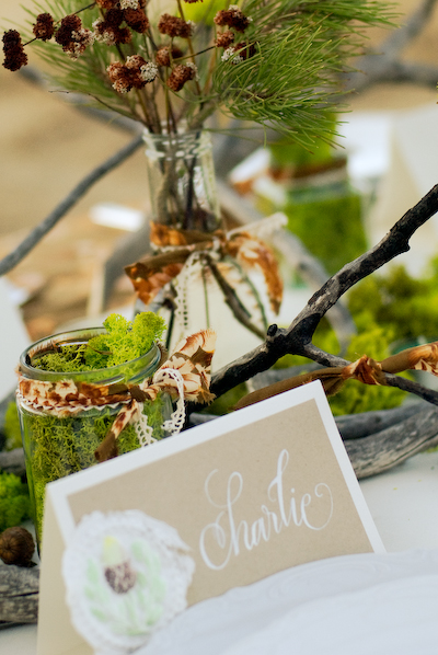
"Lauryl told me they were planning a rustic-themed wedding, staged outdoors on Esther's property. I looked at the inspiration board she created in order to get a general feel for the job and a sense of the colors to be used. Originally I thought to draw some manzanita branches on the invitation and placecards, but when she told me that they would be using acorns, my mind immediately went to my acorn molds. I was in "molded cookie production mode" at the time, but I had also used the molds for paper castings and thought they would work perfectly for this project. The pure cotton linters that I press into the molds give such a fresh, earthy feel to the castings.
After they dry completely, I hand paint them with special watercolors for that purpose (the pigments bleed less). They are tricky to paint because the water is rapidly reabsorbed into the fiber. While at my printer's looking at paper samples, I happened on the recycled "Desert Sand" brown stock. I knew immediately it was the look I wanted for this job... and that it would make a good background for the castings. I added the rich, textured watercolor paper as the background stock because I felt the additional contrast was needed, and I liked the way that it worked with the castings. It had a similar handmade quality (which it isn't!) and that very natural fiber feel (which it is!). I combined the light and dark inks on the invitation suite but stuck with the white for the placecards. I was very pleased with the finished products, but the real thrill was seeing them in the tablescape setting where they appeared to capture so well the feeling of the wedding. I also love it when the invitation tells guests a great deal about the event to come!"