Showing posts with label Invitations. Show all posts

Wednesday, December 16, 2009

Rustic Eco-Chic Suite

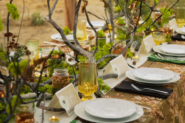
Here is the entire suite that I did for a rustic eco-chic photoshoot!


Invitation and calligraphy by Victoria Hoke Lane.


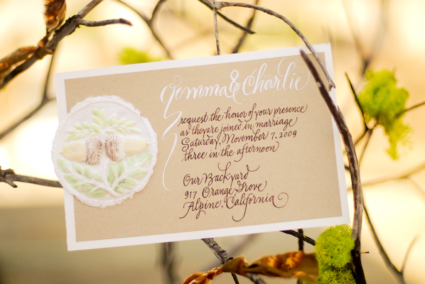
Invitation.


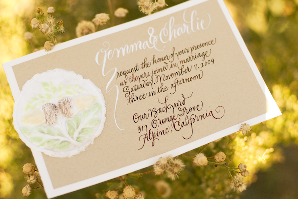
Invitation.


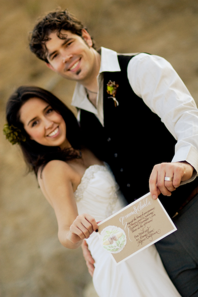
Invitation.


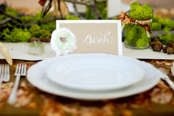
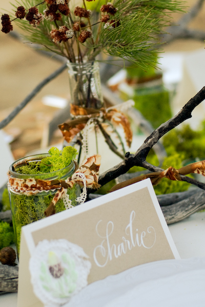
Place card.


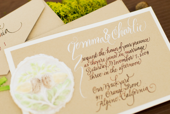
Invitation.


Outer envelope, inner "folder," invitation.


Place card.


Place card.


Place cards.


Place card.


Floral design & styling by Lauryl Lane.  Photographs by Esther Summerville Ramsey.

The Bride's Cafe ~ Featured!


Invitation & Calligraphy by Victoria Hoke Lane of Calligraphos, Ink.  
Styling by Lauryl Lane.  Photography by Sumerville & Co Photography.

I recently collaborated with my daughter Lauryl Lane and Esther Ramsey on their gorgeous rustic eco-chic faux wedding photo shoot.  The images were featured by the lovely Janie at The Bride's Cafe in two parts: Part One & Part Two. I'll post all of the images here shortly!

Here's what I said about the creation of these paper products:

"Lauryl told me they were planning a rustic-themed wedding, staged outdoors on Esther's property. I looked at the inspiration board she created in order to get a general feel for the job and a sense of the colors to be used.  Originally I thought to draw some manzanita branches on the invitation and placecards, but when she told me that they would be using acorns, my mind immediately went to my acorn molds.  I was in "molded cookie production mode" at the time, but I had also used the molds for paper castings and thought they would work perfectly for this project.  The pure cotton linters that I press into the molds give such a fresh, earthy feel to the castings.

 After they dry completely, I hand paint them with special watercolors for that purpose (the pigments bleed less).  They are tricky to paint because the water is rapidly reabsorbed into the fiber. While at my printer's looking at paper samples, I happened on the recycled "Desert Sand" brown stock. I knew immediately it was the look I wanted for this job... and that it would make a good background for the castings. I added the rich, textured watercolor paper as the background stock because I felt the additional contrast was needed, and I liked the way that it worked with the castings.  It had a similar handmade quality (which it isn't!) and that very natural fiber feel (which it is!). I combined the light and dark inks on the invitation suite but stuck with the white for the placecards. I was very pleased with the finished products, but the real thrill was seeing them in the tablescape setting where they appeared to capture so well the feeling of the wedding.  I also love it when the invitation tells guests a great deal about the event to come!"

Thursday, August 27, 2009

More Tulsa Wedding Show


The Calligraphos, Ink booth at The Tulsa Wedding Show was located right next to The Oklahoma Photo Booth. I could not resist bopping inside with Lauryl to ham it up a bit just as the last guests were leaving the show and the venders began breaking things down. We were pretty goofy by that time as can be attested to by the pics! Note us comparing our looong tongues (I cannot imagine where she got hers!).

Lauryl has recently posted her photos of and remarks about the Calligraphos, Ink booth at the show. Since the only shots of it that I've posted thus far were taken on my iphone, I thought you readers would enjoy seeing Lauryl's blog.

Monday, August 17, 2009

The Calligraphy Lesson : Part Two, Script


Calligraphy by Victoria Hoke Lane
Invitation by Marcel Schurman Company, Flora Bella Collection by Brenda Walton; Hunt nib

This lettering inscribed on the gifted Brenda Walton's beautiful invitation design is an example of pen-made script. We've already learned that pen-made means those letters have come directly from the pen, and in the case of original art such as the earlier italic example as well as this fill-in-the-blank invitation, these letters are not retouched. What you see is what you get, including mistakes, which I have lovingly come to regard as almost charming (read almost) in my many years of experience.


Script letters are made with a pointed nib. The weight of the thicks vs. thins depends upon the flexibility of the nib and the pressure exerted on it. Believe it or not, as recently as 100 years ago, every educated person could write a decent script hand. If you want to improve your self-esteem, improve your handwriting...but that needs to be the subject of another post. Although script is lovely for a brief note or a beautiful placecard, it doesn't lend itself well to long texts as it is difficult to read. Helvetica didn't become universally used for nothing!


Calligraphy by Victoria Hoke Lane
Invitation by Bella Ink Designs; Brause nib, 1mm

I've included this example because it shows what is possible in terms of variations on a given style. I chose this portrait style card stock because it matched the Bride's color scheme. It also had another coordinating landscape style card with an equally saucy little design that lent itself well to the rehearsal dinner invite I was also designing. In keeping with the modernity of the design, I used a kind of script variation. In addition to writing loosely and paying little or no attention to "staying within the lines," I used a broad-edged pen nib instead of a pointed one. That resulted in abrupt changes in thicks and thins as opposed to the extreme thins and the "swelling quality" present in traditional script thicks.


Although the letterforms are based on script, because the broad-edged pen was used one might even mistake it for a kind of italic. It has a certain element of elegance, but it is light-hearted as well. When choosing styles of lettering, the formality of the actual event, and the design and/or paper stock are important considerations. Certain lettering styles could be very inappropriate in spite of being beautiful in and of themselves.


{TBC}